tool
Calendar Control
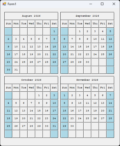
Calendar Control is a custom WinForms control that draws month calendars using GDI+ — no third-party dependencies, no host of nested child controls, just one control that paints itself. You tell it how many calendars to show across and down and which month to start from, and it lays out a tidy grid of months with shaded weekend columns, month and weekday headers, and numbered days.
Why it exists
Sometimes you don't want a full-featured date picker — you just want to show a few months at a glance. A quarter view on a dashboard, a three-month strip on a report screen, a year-at-a-glance wall. The built-in MonthCalendar fights you on layout and styling, and dropping twelve of them on a form is a mess of controls to wire up. Calendar Control does the drawing itself: one control, a couple of properties, and you get exactly the grid of months you asked for.
What it does
- Grid of months, your dimensions — set how many calendars wide and how many high, and it tiles them in that layout
- Starts wherever you want — pick a start month and each cell steps forward one month from there
- Weekend shading — Sunday and Saturday columns are tinted so the work week reads at a glance
- Clean headers — each month shows its name and year, with a row of weekday abbreviations beneath
- Owns its resources — pens, brushes, and fonts are created once and disposed properly, so nothing leaks
- Flicker-free — double-buffered painting keeps redraws smooth when the form resizes
- Designer-friendly — every setting is a property in the Properties window under a Calendar category
How to use it
Add CalendarControl.cs to your project and rebuild. The control then appears in your Toolbox — drag it onto a form like any other control, or add it in code:
var calendar = new CalendarControl
{
    CalendarsWide = 2,
    CalendarsHigh = 2,
    SquareSize    = 30,
    StartMonth    = DateTime.Now,
    Location      = new Point(12, 12)
};
this.Controls.Add(calendar);
That gives you a 2×2 grid — four months — starting with the current month.
Customizing it
Everything you'll reach for is a public property, editable in the designer or in code:
CalendarsWide— how many months across (default 1). Combined withCalendarsHigh, this sets the total: a 3-wide, 4-high grid shows a full 12-month year.CalendarsHigh— how many months down (default 3).SquareSize— the size in pixels of a single day cell (default 30). Bump it up for a bigger, more legible calendar; drop it for a compact strip. Everything else scales from this one number.StartMonth— the month shown in the first cell (default today). Each subsequent cell advances one month.
Sizing tip: after setting the grid dimensions, read PreferredCalendarSize to get the pixel size needed to show every month without clipping, and apply it:
calendar.Size = calendar.PreferredCalendarSize;
Colors and font are defined once in the control's constructor — the black grid lines, the light-blue weekend fill, and the Courier day font. To restyle, change the brush and pen colors there (for example, swap Color.LightBlue for a softer weekend tint, or change the Font to match your app). Because the control owns and disposes these, keep any replacements inside the constructor and Dispose so nothing leaks.
Under the hood
The whole control is a single OnPaint pass. It walks its grid row by row and column by column; for each cell it draws the day squares, fills the weekend columns, writes the month and weekday headers, then places each day number in the right column by asking .NET which weekday that date falls on. Saturdays trigger a wrap to the next week row. There are no child controls and no per-day widgets — it's all one flat drawing, which is what keeps it cheap to render and simple to reason about.
Resource handling is the part that's easy to get wrong and easy to get right: the pens, brushes, font, and text formatter are built once when the control is created and released in an overridden Dispose. The Graphics object handed to OnPaint is left alone, because WinForms owns that one. Double-buffering is switched on so resizes don't flicker.
Get it
Built for Windows, no installer — a single source file you drop into any WinForms project.
← back to tools